©2025 ALL RIGHTS RESERVED
Pace & Print
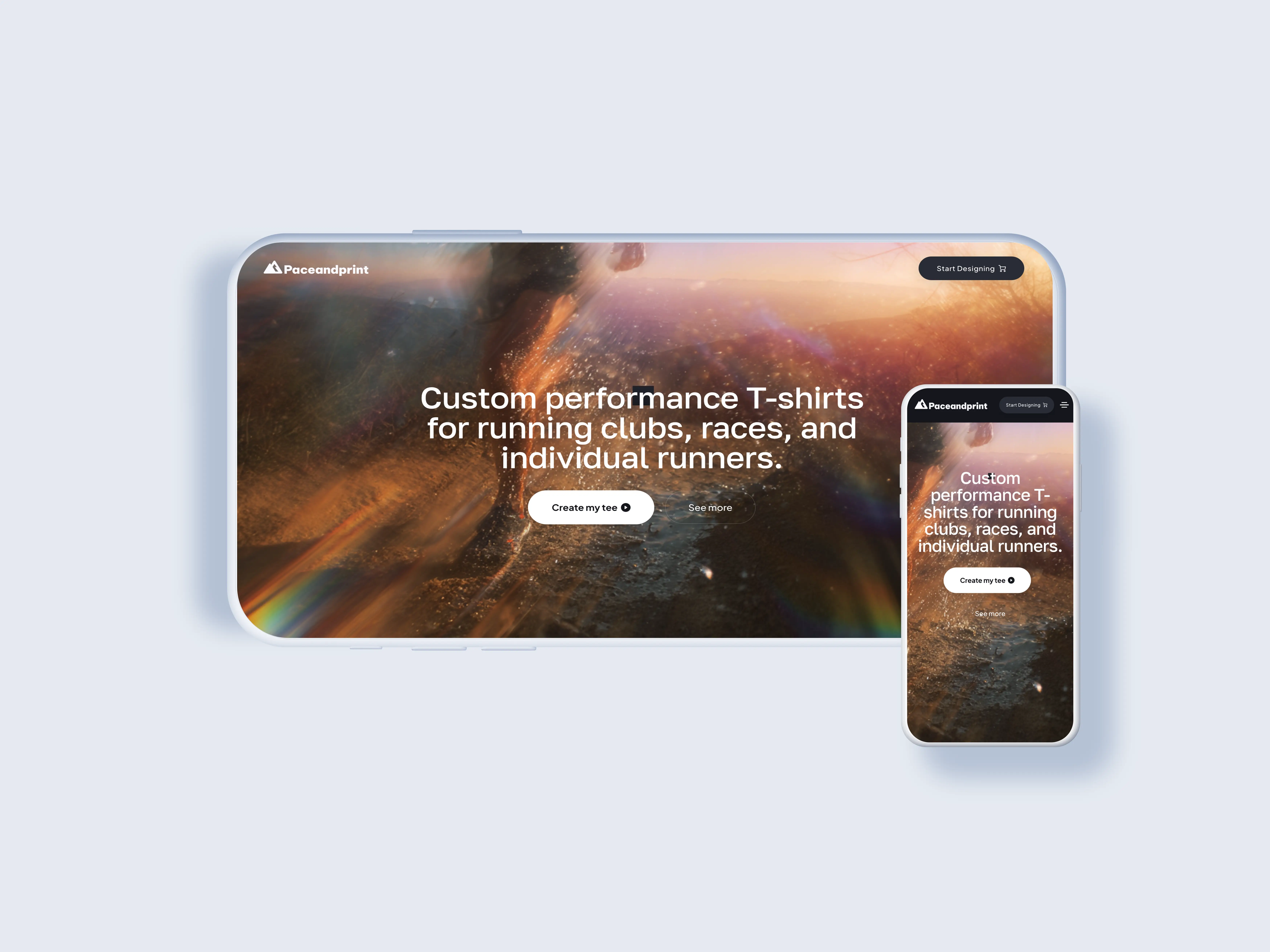
In the dynamic world of sports and events, visual identity and the quality of gear are paramount. We are introducing an innovative SaaS solution designed to transform how marathon organizers, race directors, and sports club managers design, purchase, and manage their team apparel and merchandise.
Project
[ Pace&Print App]role
[ ux/ui design ]Time Line
[ Dic 2024 - July 2025 ]Live Project
[ GooglePlay ]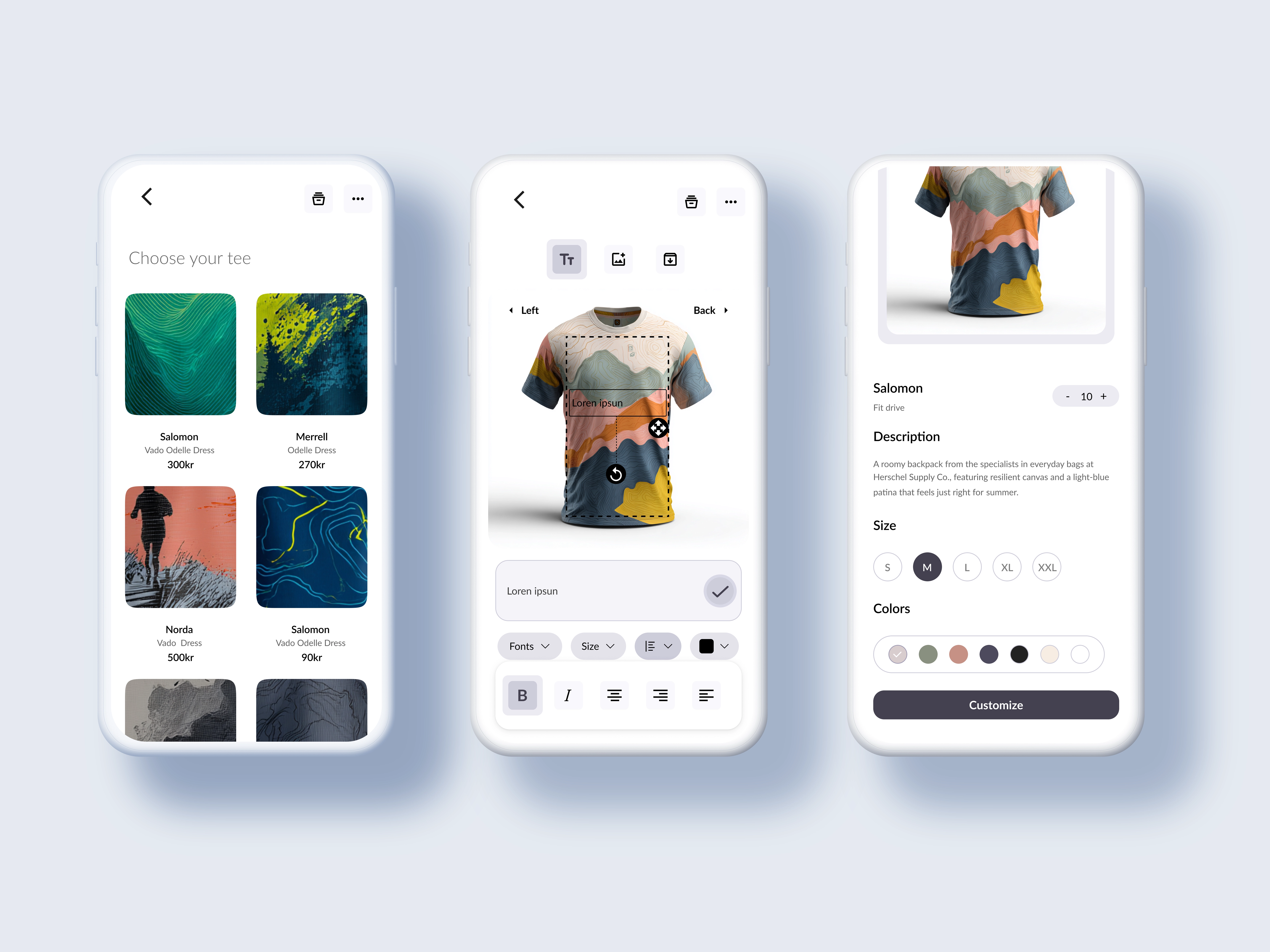
The Ask
Smart Subscription Model: Provides continuous access to the platform, premium design features, and preferred production rates through a flexible subscription adapted to the needs of event organizers and clubs. Integrated White-Label Solution: A complete system that allows event managers not only to create and purchase their apparel but also to manage and automate the entire order fulfillment and distribution workflow, effectively offering a self-branded, seamless e-commerce experience to their runners and club members.
The Design
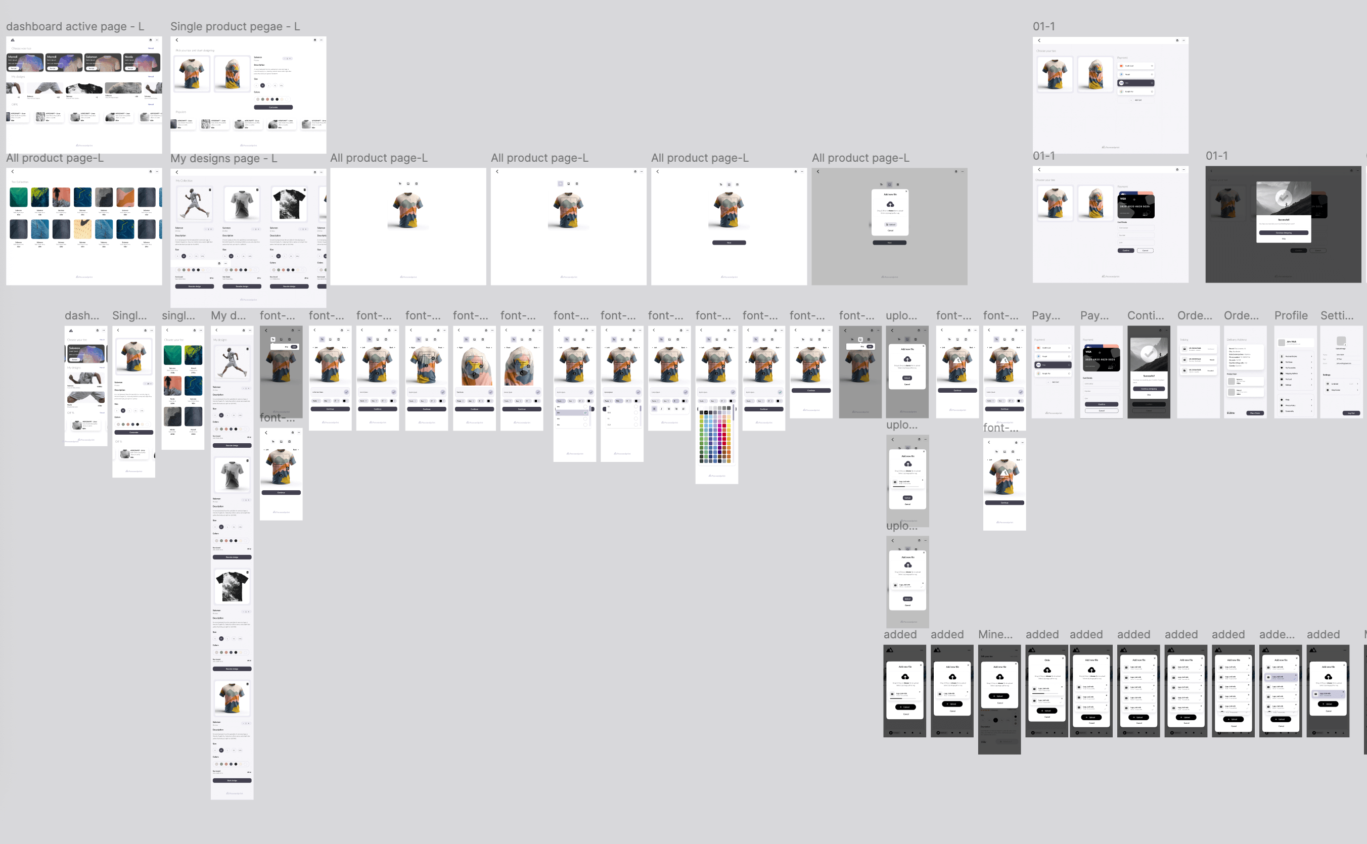
The design process for a sophisticated platform like this, combining an immersive customizer, a shopping experience, and a white-label backend is intricate and requires a user-centric approach. The core design effort focused on achieving a balance between powerful features and effortless usability, particularly for managers with limited time.
 TIMELAPSE
The development
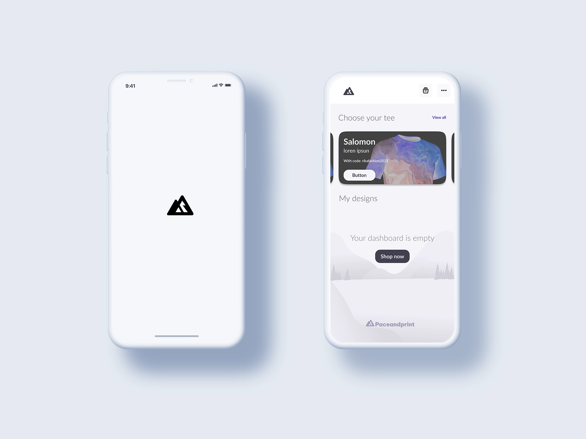
Goal: To create a platform where designing a complex, full-coverage shirt (like the topographic design shown) feels as easy as customizing a simple logo placement.Focus: Mapping the "Manager Journey" (Design $\rightarrow$ Subscription $\rightarrow$ Launch White-Label Store $\rightarrow$ Order Management).Wireframing & Prototyping (Information Architecture):The Customizer: Prioritized a mobile-first approach, as seen in the screen grabs. The key tools (Text, Image Upload, Save) are prominent and easy to access.Design Tools: Ensuring clear access to design adjustments (rotation, resizing, placement of text/images) without cluttering the screen. The use of the dashed outline and interactive handles for the design area is critical for clarity.
The Takeaway
Visual Design & Branding: Aesthetics: The interface uses a clean, modern, and performance-oriented aesthetic, aligning with the target audience of running clubs and races. Color Palette: Utilizing a restrained palette with functional use of gray, purple-gray, and subtle accents for interactive elements to keep the focus on the product and the custom design. Consistency: Ensuring the design language is consistent across the product discovery page, the customizer, and presumably the white-label backend.
Design system
That's a great request! Building a professional resume section about the design system for Paceandprint requires highlighting the impact, methodology, and design principles you established. Here is a structured section for your resume/portfolio, focusing on the Design System and Principles. Design System & UX/UI Architecture: Paceandprint Project Overview / Paceandprint is a SaaS platform providing a comprehensive custom t-shirt design engine and a white-label order management solution for sports clubs, race organizers, and individual runners. Paceandprint Design System (PDS) I conceptualized and built the PDS, a unified, scalable design framework to govern the multi-platform experience (Customizer App, E-commerce Storefront, and White-Label Admin Portal). Goal: To ensure consistency across all touchpoints, accelerate development velocity, and maintain an intuitive and high-performance user experience. Key Components: Developed a component library (Atomic Design methodology) including custom buttons, input fields, navigation elements, and specialized modules for the core 3D Customization Engine (e.g., color pickers, text overlay controls, rotation handlers). Architecture: The PDS defined the visual language, motion standards, accessibility guidelines, and technical implementation (tokenization) for front-end development.
DS
Core Design Principles The PDS was founded on principles that specifically address the needs of high-stakes event managers and performance-driven individual users: Intuition Materialized (Clarity & Ease of Use):Principle: The complex process of full-coverage apparel customization must feel elegantly obvious. Implementation: Prioritizing mobile-first layouts (as seen in the app screens) and using clear visual hierarchy. Customization tools (Text, Image upload, Save) are persistently available but non-obtrusive, ensuring the focus remains on the product rendering. Designing for Trajectory (Strategic Impact): Principle: Design must facilitate growth and business goals (subscriptions, bulk orders) over mere functionality. Implementation: Strategic placement of high-value CTAs (like "Customize" and "Add to Cart"), and streamlining the manager's flow from Design Launch White-Label Store.Visual Narrative Weaving (Aesthetics & Performance): Principle: The design must reflect the high-performance nature of the product. Implementation: Employing a clean, modern aesthetic with a focused, minimal color palette (utilizing performance-grey, white space, and strategic color accents) to ensure the user's custom design (the product) is always the focal point. Seamless Context Switching (Efficiency): Principle: Users must be able to switch between tasks (e.g., choosing a size vs. customizing a graphic) without losing progress or context. Implementation: Ensuring clear separation between the Product Details View (Size, Colors, Description) and the Customization Canvas, allowing fluid movement back and forth during the purchase process.
Next Project
[ world surf league ]
Bold and
confident
Turning ideas into intuitive, digital realities.
“collaborate with me to craft exceptional designs
reflect your unique vision.”